
How To Create Data Graphs in Microsoft Excel
This tutorial shows how to create a complex data graph in MS Excel 2010, using data from your excel spreadsheet. After you complete your graph, MS Excel allows you to copy your work to every MS Office product, including MS Word or PowerPoint which is useful if you want to present a chart made in Excel.
Selecting Data For Your Graph
The first step that you'll need to undertake is to select your source data for your graph. If you wish to design a graph based on the data from a single table, it is enough to select only a cell from that table, but if you wish to create a graph using certain rows or columns from the data table, then you'll need to select those areas.
Choosing the Graph Type
After you've selected the data for your future graph, it's time to select your graph type. To view the available types of graph in MS Excel 2010 version or above, just click on the Insert ribbon tab.You'll see that a section called "Charts" is displayed. That section contains the graph types.

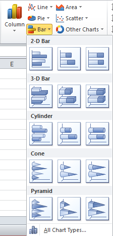
Every graph type contains several subtypes. To view the whole gallery of a graph type, for example Bar charts, click on Bar button.
Additionally, you can click All Chart Types to view the gallery of every graph category.
The screenshot below illustrate an example on how the graph is generated. In this example, the graph displays who bought the items of a store, using a pie chart.

The first one, the Design tab, allows you to change the design of your chart, as well as changing the type of the chart. Also, the Select Data option is displayed here, which allows you to insert the data series manually in order to generate a graph.
Changing Rows and Columns
Let's presume that we have the following table that we want to transform into a graph:

The above table displays the average wages for New York and Los Angeles. Let's assume that you want to create a column type , bidimensional graph. Just click within the table, and go to Insert > Column and choose a 2-D column graph. The result looks like the following figure:

This view displays the average wage for every city on each of the three years. To display the average wage drilled down on years for each of the two cities, click on the graph, choose the Design ribbon tab, and click Switch Row/Column. After this, you should have the following result:

Note: If the table is taking into account the first cell of the header row from your table, in this case, the "City" cell, it means that you just wrote on the cells without creating a table. To have the graph generated properly, you should create a table first.
Choosing the Layout of the Graph
The layout of the graph allows you to change elements such as Title, Legend, Axes or Gridlines. If you want to experiment with different layouts for your graph, click your graph to enable the Chart Tools section on the ribbon. Next, click on Layout to view the available options for editing the graph layout. For example, if you want to add titles to your axes, click the Axis Title button, and choose the axis that you want to hold the title.
If you wish to change the style of the graph, meaning that you want to change the design of the columns, go to the Design tab, and click arrow on the Chart Styles section. A gallery of styles is displayed:

Moving the Graph on a Different Sheet
You have the possibility to move your graph if you don't wish to display the data and the graph on the same sheet. To do that, follow the steps below:
- Click on your graph and choose MoveChart from the Design tab.
- Notice that a dialog box pops out. On this dialog box, select Object In button, and choose the sheet where you want to move your graph.
Advanced Chart Formatting
Creating a basic graph involves choosing your data for visual representation, choosing the type of graph and also choosing the design details of the graph. Excel enables you to opt for additional options for customizing your graph. For example, if you want to choose another color for one of chart's columns, presuming that you have a column type chart on your sheet, click on the column and then select the Format tab on the ribbon.
Notice that you can change the column color by selecting a new color from the Shape Fill menu, or you can outline the graph column by choosing an option from the Shape Outline menu. To view all the objects of your graph, on the Format tab, click the drop-down arrow from the left side of the ribbon:

Notice that you can change the column color by selecting a new color from the Shape Fill menu, or you can outline the graph column by choosing an option from the Shape Outline menu. To view all the objects of your graph, on the Format tab, click the drop-down arrow from the left side of the ribbon:
After you've selected the element that you want to modify, click Format Selection and choose the modifications that you want to perform. For example, you can choose a thicker line for representing one of the graph axis. To do this, choose one of the axis on the graph element drop-down list (the one from the screenshot above). After you've selected the axis, click Format Selection, and go to the Line Style menu. Here, you can choose how the line should look like, by choosing its width or its type (dash, compound etc.).
Moreover, you can adjust the graph elements using your mouse.
Editing the Axes
To change the numbers displayed on your axes, choose the axis element on the graph element drop-down list (the one from the above screenshot), and select Format Selection. On the first menu, choose the Minimum or the Maximum value represented on the axis, as well as other options like axis labels.
Notice that for the 2-D graphs, there are only two axis represented on the graph element drop-down list. The tridimensional graphs have a third axis, known as "depth axis".
Formatting the Data Series
MS Excel allows you to assign the secondary axis to a data series. This is required if the data series cannot be represented using the same type of data. To introduce the secondary axis, you need to select the axis that you want to transform into a secondary axis. After that, click Format Selection on the Format tab, and notice that the Series Option menu is displayed. On this menu, select whether or not the selected data series should be treated as primary or secondary axis. Beside this, you can select if the columns should be displayed separately or overlapped.
Adding a Tendency Line
Tendency lines, also known as trendlines, are used to predict the behaviour of a certain data type. These lines are used especially for developing Pareto charts. To add a trendline, right-click a data series, and choose Add Trendline from the context menu. The following window is displayed.

Here you can choose the type of the trendline. Furthermore, you can edit the way the trendline is projected by defining the forecast points.
Example: Creating a Combination Chart
This example shows how to create a combination chart using the tips covered by this tutorial. You can try to create your own combination chart, or you can follow the steps listed below.
So let's suppose that you own a book company, and you want to see how the sales evolved after you implemented a new distribution system for decreasing the time of delivering the books to the clients.
First, you need to define the data in a table, like the one displayed below:

The next step would be to highlight the newly created table, click Insert ribbon tab, click on Line drop-down list to view the available line charts, and then select Line with Markers.


Notice that a line chart is generated. To increase the visibility of the Distribution Time line, double click the Primary Axis (Sales line) and switch it to the Secondary Axis. The following figure shows how the line graph should look like.
Next, you need to select the red line (Sales line), click Insert ribbon tab, click on Column drop-down list, and choose the Clustered Column type of chart.

The combination chart is now created! It is now visible that the distribution time had a considerable impact on the sales process. The following screenshot shows the final chart:

See you at the next tutorial!
No comments:
Post a Comment